PIMA — The only issue was italic versus block.
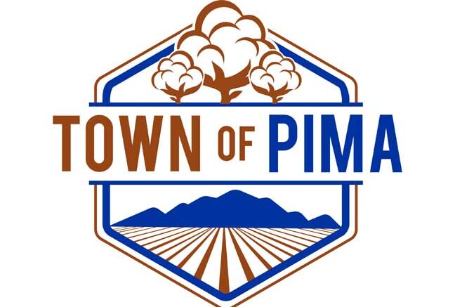
At its most recent meeting, the Pima Town Council voted 3-2 to adopt a new logo for the town.
There was no debate over the actual logo — a hexagon with cotton bolls in gold at the top, lettering through the middle, Mount Graham in blue below the lettering and gold farm rows at the bottom — it was whether to make “of” in Town of Pima italic or block lettering.
Voting in favor of the block lettering was Vice Mayor Sherrill Teeter and Council members Brian Paull and C.B. Fletcher.
City Manager Vernon Batty said the first step is getting the logo copyrighted before it starts being seen around town.
“We need to start getting new business cards, need to talk to a company about getting it on our trucks,” Batty said. “Again, a town logo is not like a school logo, where everybody rallies around it. A lot of people don’t even know what the town logo is. So we’re not going to go too far into getting it out to the public, just put it on everything that we do.”
Batty also showed the council conceptual designs for new welcome signs. The designer is metal artist Rick Merrill, who designed the Welcome to Thatcher signs and is in the process of fabricating new wayfinding signs for the Safford Downtown Association.
The design Merrill is proposing for Pima is a tower, evoking the image of Midwestern water towers used to identify communities.
The council directed Batty to continue discussions with Merrill in order to finalize a design that can be brought back for possible approval.


